How to Take Better Phone Images
Have you ever wanted to take a picture of something interesting and thought, “But I only have my phone on me!” Your phone can actually take some pretty good pictures, and knowing some helpful tips and tricks can make it easier to do so.
The video below explains practices and settings that you can incorporate into your own picture-taking to produce higher-quality photos. You’ll also find a few tips and examples, segments from the video — an overview of Rule of Thirds and Focus — below.
Video: How to Take Better Phone Images (YouTube)
Tips and Examples
Rule of Thirds
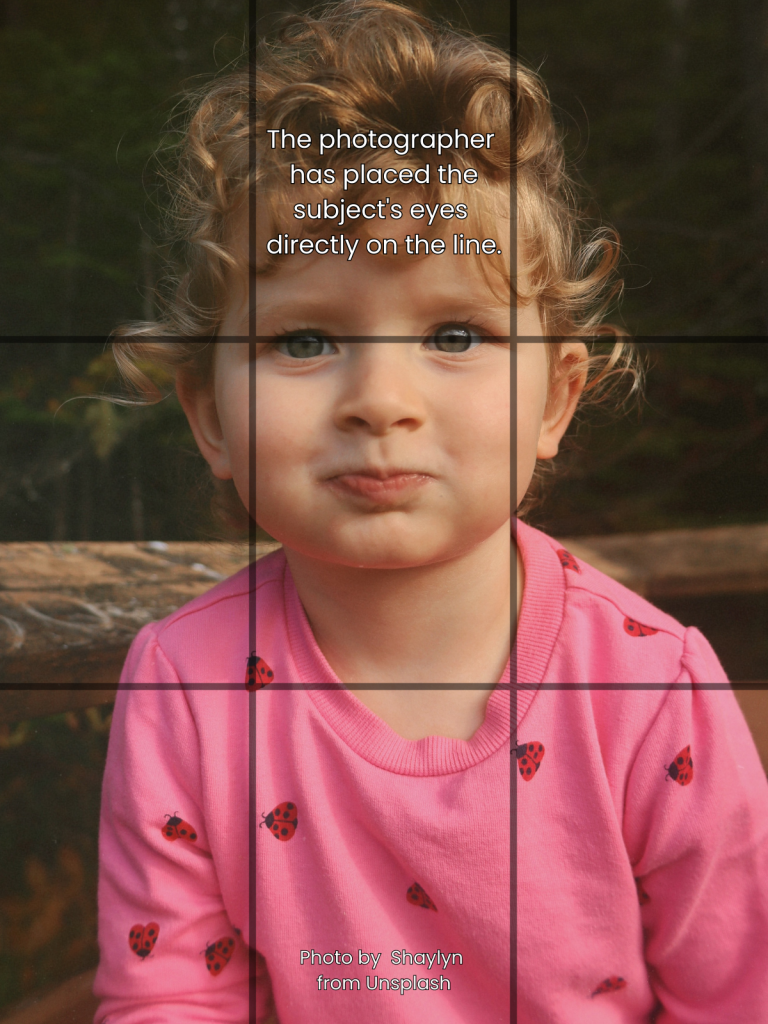
The Rule of Thirds is a method that helps with framing your subject when taking a photo. Lining their body with a vertical line or eyes with a horizontal line can lead to a better photo than just placing your subject in the center of your shot, such as in Example 1.
It also helps with creatively using the negative space in your photo, which is the space that isn’t occupied by your subject.
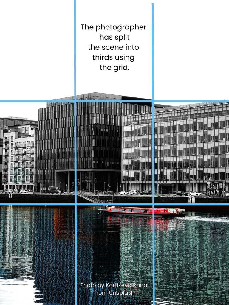
In Example 2, the buildings are centered between the sky and the water, with each element aligned within their respective “third” of the image. The boat is lined up at the intersection of two lines, which also demonstrates the Rule of Thirds.
Check out the video for how to turn on your phone’s grid!
- Example 1
- Example 2
Focus
Sometimes when we try to take a photo, our subject is blurry and the background is clear. Adjusting the focus of your image before you take it will give you a higher-quality photo than just taking the picture without choosing a focus.
In Example 3, the subject (someone holding a box) is in focus while the background (plants and other people) are blurred. This draws our attention to the person holding the box.
In Example 4, our attention is drawn to the subject of the image (the first cow), with the background (grass and other cows) having less focus.
- Example 3
- Example 4
What Else Makes a Good Photo?
Good photos include the following elements:
- Purpose. Photos should convey information, tell a story, cause an emotional response, or communicate a message.
- Sharp focal point. If a photo is blurry, too dark, or too light, don’t use it.
- No distracting details. These might include unrelated objects that dominate the picture, identifiable names, images or logos on apparel (other than UMaine, Extension, and 4-H), photo bombers, and oddly-placed background objects (is there a plant or a lamp growing out of someone’s head?), etc.
- Engaging. Subjects are expressive or detailed enough to make the viewer understand or feel something.
- Good composition. Crop out unnecessary details. Consider the Rule of Thirds (PM website).


